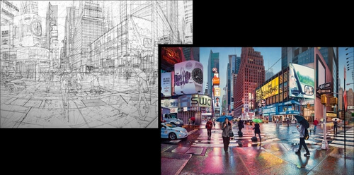
Studying basic pencil drawing, finished sketching oil paintings on linen.
Artist Nathan Walsh with his amazing drawings and paintings.
Many of the pieces below contain both, one of them. The rest I just included the panels.
Sheer beauty and perfection in the details in both illustrations. The colors in the painting seem to better distinguish subtle tonal changes, close-ups, and overlapping details. This is where the graphics come in: they are so packed with information that they are almost hard to read.
Great way to make us aware of the amount of work and precision that goes into each of these pieces.
In a way, the drawing sets the playing field and the paintings strike it out of the park with a beautiful, realistic execution.
Take a look below and see what you think.
For more of Walsh’s work here on DesignStack, click on this link.
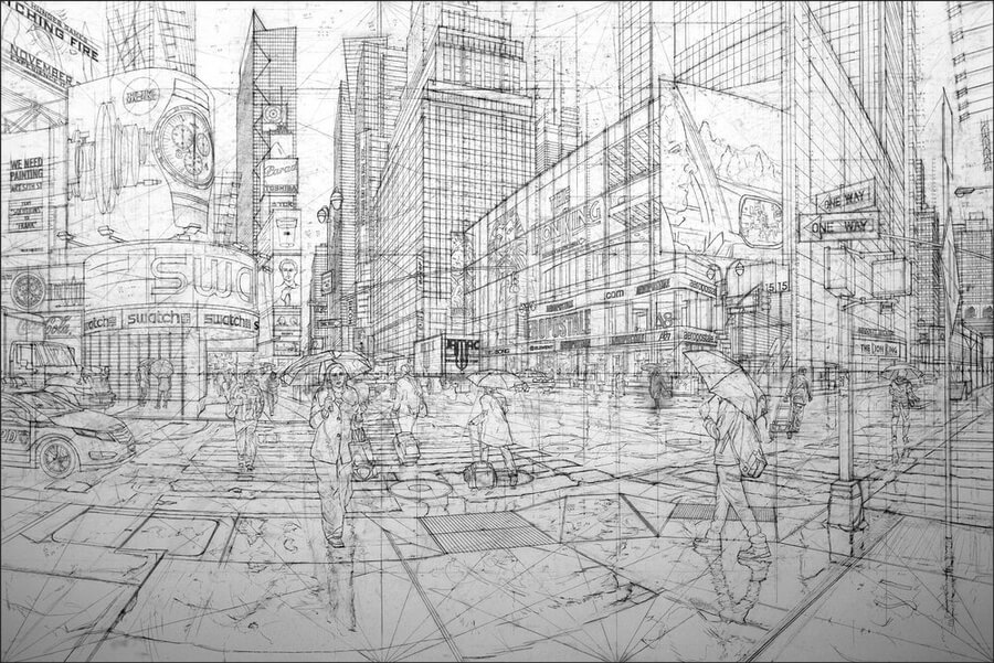
Mandarin Oriental. Click on the image to enlarge it.

Mandarin Oriental. Click on the image to enlarge it.

Mandarin Oriental. Click on the image to enlarge it.

Mandarin Oriental. Click on the image to enlarge it.
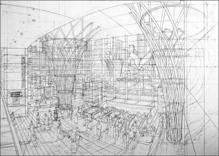
skylight. Click on the image to enlarge it.

skylight. Click on the image to enlarge it.

Delmonico. Click on the image to enlarge it.

Delmonico. Click on the image to enlarge it.

Transamerica. Click on the image to enlarge it.
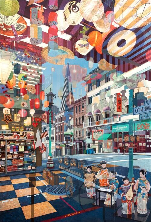
Transamerica. Click on the image to enlarge it.

Buhaira Street. Click on the image to enlarge it.
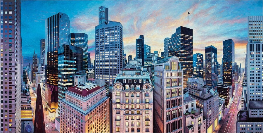
Peninsula. Click on the image to enlarge it.

twilight. Click on the image to enlarge it.

Z bar. Click on the image to enlarge it.

Bryant Park. Click on the image to enlarge it.
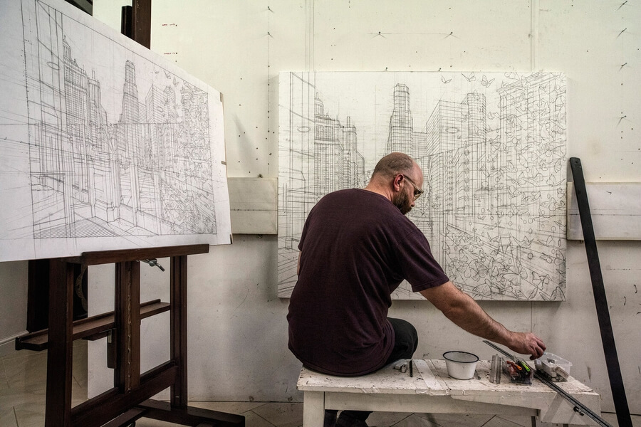
Artist at work. Click on the image to enlarge it.